[shadcn/ui] Select Component -> Multiple Select Component 커스텀
🍀 목차
새로운 prop 만들기
Select Component의 메서드 활용하기
작성한 스토리
회고
개요
단일 선택만 가능한 shadcn/ui의 Select를 다중 선택이 가능하도록 Multiple Select로 커스텀해보자.
새로운 prop 만들기
Anatomy
import * as Select from '@radix-ui/react-select';
export default () => (
<Select.Root>
<Select.Trigger>
<Select.Value />
<Select.Icon />
</Select.Trigger>
<Select.Portal>
<Select.Content>
<Select.ScrollUpButton />
<Select.Viewport>
<Select.Item>
<Select.ItemText />
<Select.ItemIndicator />
</Select.Item>
<Select.Group>
<Select.Label />
<Select.Item>
<Select.ItemText />
<Select.ItemIndicator />
</Select.Item>
</Select.Group>
<Select.Separator />
</Select.Viewport>
<Select.ScrollDownButton />
<Select.Arrow />
</Select.Content>
</Select.Portal>
</Select.Root>
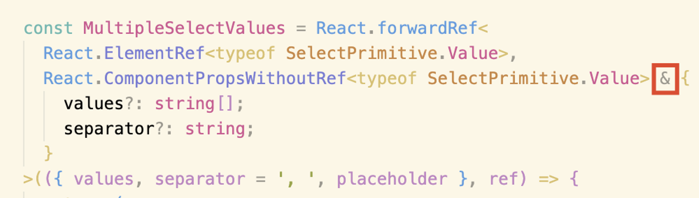
);기존 SelectValue는 SelectTrigger안에서 선택한 값을 반영하는 역할을 한다. SelectValue와 같이 SelectPrimitive.Value를 사용하되 인터섹션으로 새로운 prop을 추가한다. 여러 개의 string값이 들어오는 values와 values를 어떤 분리 기호로 나눌지 정하는 separator를 추가해 줬다.
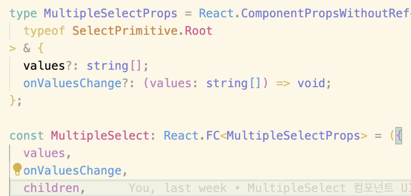
혹은 아래와 같이 별도의 type으로 전달한다.
Select 컴포넌트도 위와 같은 역할을 하는 values와 이 values가 변경되면 작업을 수행하는 onValuesChange 이벤트 핸들러를 추가해 주었다.
Select Component의 메서드 활용하기
Headless UI인 Radix UI와 이를 사용한 Shadcn/ui는 변경에 굉장히 유연하다. 그렇기에 기존 기능으로 새로운 기능을 구현하는 데 큰 도움을 받을 수도 있다.
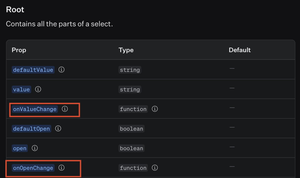
Select에는 value가 변할 경우 호출되는 onValueChange와 Select(Root)의 open state가 변경되면 호출되는 onOpenChange 핸들러가 존재한다.
이를
onOpenChange로 Select가 열릴 때마다 value값을 null로 변경시킨다.onValueChange로 선택된 value로 변경되면 새로운 prop인 values에 반영시켜 렌더링 한다.
이렇게 수정하여 MultipleSelect를 구현할 수 있다.
type MultipleSelectProps = React.ComponentPropsWithoutRef<
  typeof SelectPrimitive.Root
> & {
  values?: string[];
  onValuesChange?: (values: string[]) => void;
};

const MultipleSelect: React.FC<MultipleSelectProps> = ({
  values,
  onValuesChange,
  children,
  ...props
}) => {
  const [value, setValue] = React.useState(null);

  return (
    <SelectPrimitive.Root
      value={value}
      onOpenChange={() => {
        // NOTE : onValueChange 호출을 위한 setValue 변경
        setValue(null);
      }}
      onValueChange={(value) => {
        let selected = [...values];
        if (values.includes(value)) {
          selected = values.filter((curr) => curr !== value);
        } else {
          selected.push(value);
        }
        onValuesChange(selected);
      }}
      {...props}
    >
      {children}
    </SelectPrimitive.Root>
  );
};
MultipleSelect.displayName = 'MultipleSelect';

const MultipleSelectValues = React.forwardRef<
  React.ElementRef<typeof SelectPrimitive.Value>,
  React.ComponentPropsWithoutRef<typeof SelectPrimitive.Value> & {
    values?: string[];
    separator?: string;
  }
>(({ values, separator = ', ', placeholder }, ref) => {
  return (
    <SelectPrimitive.Value ref={ref}>
      {values && values.length > 0
        ? values.map((value, index) => (
            <span key={value}>
              {value}
              {index !== values.length - 1 && separator}
            </span>
          ))
        : placeholder}
    </SelectPrimitive.Value>
  );
});
MultipleSelectValues.displayName = 'MultipleSelectValues';

const MultipleSelectScrollDownButton = React.forwardRef<
  React.ElementRef<typeof SelectPrimitive.ScrollDownButton>,
  React.ComponentPropsWithoutRef<typeof SelectPrimitive.ScrollDownButton>
>(({ className, ...props }, ref) => (
  <SelectPrimitive.ScrollDownButton
    ref={ref}
    className={cn(
      'flex cursor-default items-center justify-center py-1',
      className,
    )}
    {...props}
  >
    <Icon name='ChevronDown' size='tiny' color='gray' />
  </SelectPrimitive.ScrollDownButton>
));
MultipleSelectScrollDownButton.displayName = 'MultipleSelectScrollDownButton';

const MultipleSelectItem = React.forwardRef<
  React.ElementRef<typeof SelectPrimitive.Item>,
  React.ComponentPropsWithoutRef<typeof SelectPrimitive.Item> & {
    values?: string[];
    color?: keyof typeof CUSTOM_COLORS;
  }
>(({ values, color = 'gray', value, className, children, ...props }, ref) => {
  const isSelected = values && values.includes(value);
  return (
    <SelectPrimitive.Item
      ref={ref}
      className={cn(
        'relative flex w-full cursor-default select-none items-center rounded-sm py-1.5 pl-2 pr-8 text-sm outline-none data-[disabled]:pointer-events-none data-[disabled]:opacity-50',
        color &&
          `focus:bg-${convertColorClassName(
            getContrastColor(color),
            200,
          )} focus:text-${convertColorClassName(getContrastColor(color), 500)}`,
        className,
      )}
      {...props}
      value={value}
    >
      {isSelected && (
        <span className='absolute right-2 flex h-3.5 w-3.5 items-center justify-center'>
          <Icon name='Check' size='tiny' color={color} />
        </span>
      )}
      <SelectPrimitive.ItemText>{children}</SelectPrimitive.ItemText>
    </SelectPrimitive.Item>
  );
});
MultipleSelectItem.displayName = 'MultipleSelectItem';
작성한 스토리
meta 정보
const meta = {
  title: 'Component/MultipleSelect',
  component: MultipleSelect,
  parameters: {
    componentSubtitle:
      '버튼으로 트리거되는 사용자가 선택할 수 있는 복수 옵션 목록입니다.',
  },
  argTypes: {
    size: {
      description: 'MultipleSelectTrigger의 크기를 설정합니다.',
      control: 'radio',
      options: ['small', 'medium', 'large'],
      table: {
        category: 'MultipleSelectTrigger',
        defaultValue: {
          summary: 'medium',
        },
      },
    },
    color: {
      description:
        'MultipleSelectTrigger, Content, Item, Separator의 컬러를 설정합니다.',
      control: 'select',
      options: Object.keys(CUSTOM_COLORS),
      table: {
        category:
          'MultipleSelectTrigger, MultipleSelectContent, MultipleSelectItem, MultipleSelectSeparator',
      },
    },
    values: {
      description:
        'MultipleSelect에서는 `onValuesChange`와 함께 사용되며 선택된 값들을 가집니다. Trigger, Values, SelectItems에 전달되어야 합니다.',
      types: 'string[]',
      table: {
        category:
          'MultipleSelect, MultipleSelectTrigger, MultipleSelectValues, MultipleSelectItem',
        defaultValue: {
          summary: '[]',
        },
      },
    },
    onValuesChange: {
      description:
        'MultipleSelect의 값이 변경되면 호출되는 이벤트 핸들러입니다.',
      table: {
        category: 'MultipleSelect',
      },
    },
    defaultOpen: {
      description:
        '해당 옵션을 주게 될 경우 MultipleSelect가 처음 렌더링되었을 때 열린 상태로 렌더링되게 됩니다.',
      type: 'boolean',
      table: {
        category: 'MultipleSelect',
        defaultValue: {
          summary: 'false',
        },
      },
    },
    name: {
      description:
        'MultipleSelect의 이름입니다. submit될 시, name/value 쌍으로 제출됩니다.',
      type: 'string',
      table: {
        category: 'MultipleSelect',
        defaultValue: {
          summary: 'string',
        },
      },
    },
    disabled: {
      description:
        '해당 옵션을 주게 될 경우 MultipleSelect 또는 MultipleSelectItem과 상호 작용할 수 없습니다.',
      type: 'boolean',
      table: {
        category: 'MultipleSelect, MultipleSelectItem',
        defaultValue: {
          summary: 'false',
        },
      },
    },
    required: {
      description:
        '해당 옵션을 주게 될 경우 submit될 시, 사용자가 값을 선택해야 함을 나타냅니다.',
      type: 'boolean',
      table: {
        category: 'MultipleSelect',
        defaultValue: {
          summary: 'false',
        },
      },
    },
    placeholder: {
      description:
        '값이 없거나 defaultValue가 주어지지 않았을 경우 MultipleSelect 내부에 렌더링될 텍스트입니다.',
      table: {
        category: 'MultipleSelectValues',
        defaultValue: {
          summary: 'string',
        },
      },
    },
    onCloseAutoFocus: {
      description:
        '`(event : Event) => void`, 닫은 후 포커스가 트리거로 이동하면 호출되는 이벤트 핸들러. `event.preventDefault`로 방지할 수 있습니다.',
      table: {
        category: 'MultipleSelectContent',
      },
    },
    onEscapeKeyDown: {
      description:
        '`(event : KeyboardEvent) => void`, Esc 키를 눌렀을 때 호출되는 이벤트 핸들러. `event.preventDefault`로 방지할 수 있습니다.',
      table: {
        category: 'MultipleSelectContent',
      },
    },
    position: {
      description:
        'MultipleSelect 선택 시 Content가 나타나는 위치를 지정합니다.',
      control: 'radio',
      options: ['popper', 'item-aligned'],
      table: {
        category: 'MultipleSelectContent',
        defaultValue: {
          summary: 'popper',
        },
      },
    },
    side: {
      description:
        'position이 "popper"일 경우만 적용됩니다. MultipleSelect가 열릴 때 어느 위치에서 열릴 지 설정합니다.',
      control: 'radio',
      options: ['left', 'right', 'top', 'bottom'],
      table: {
        category: 'MultipleSelectContent',
        defaultValue: {
          summary: 'bottom',
        },
      },
    },
    sideOffset: {
      description:
        'position이 "popper"일 경우만 적용됩니다. MultipleSelect 기준점으로부터의 거리(px)를 설정합니다.',
      type: 'number',
      table: {
        category: 'MultipleSelectContent',
      },
    },
    align: {
      description:
        'position이 "popper"일 경우만 적용됩니다. MultipleSelect의 기준점으로부터의 선호 정렬을 지정합니다. alignOffset으로 오프셋을 지정할 수 있습니다.',
      control: 'radio',
      options: ['start', 'center', 'end'],
      table: {
        category: 'MultipleSelectContent',
        defaultValue: {
          summary: 'start',
        },
      },
    },
    alignOffset: {
      description:
        'position이 "popper"일 경우만 적용됩니다. align이 "start" 혹은 "end"일 때 정렬 옵션으로부터의 픽셀 단위 오프셋을 결정합니다.',
      type: 'number',
      table: {
        category: 'MultipleSelectContent',
      },
    },
    asChild: {
      description:
        '직접 지정한 자식 요소로 렌더링을 허용하는 속성입니다. 자식 컴포넌트는 자신의 태그를 유지하며 해당 컴포넌트의 속성과 동작을 그대로 상속받아 동작합니다.',
      type: 'boolean',
      table: {
        category:
          'MultipleSelectTrigger, MultipleSelectValues,MultipleSelectContent, MultipleSelectItem, MultipleSelectGroup, MultipleSelectLabel, MultipleSelectSeparator',
        defaultValue: {
          summary: 'false',
        },
      },
    },
    separator: {
      description: '각 값 사이에 표시될 구분자입니다.',
      type: 'string',
      table: {
        category: 'MultipleSelectValues',
        defaultValue: {
          summary: '", "',
        },
      },
    },
    error: {
      type: 'boolean',
      table: {
        category: 'MultipleSelectTrigger',
        defaultValue: {
          summary: 'false',
        },
      },
    },
  },
} satisfies Meta<MultipleSelectComponentProps>;
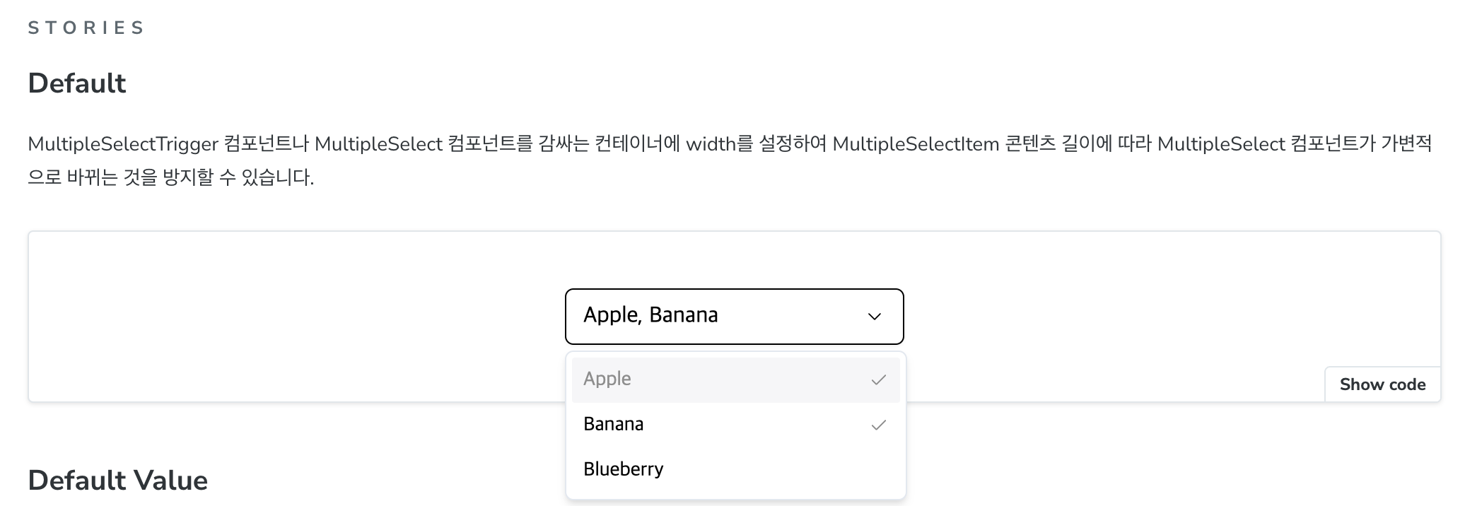
1. Default
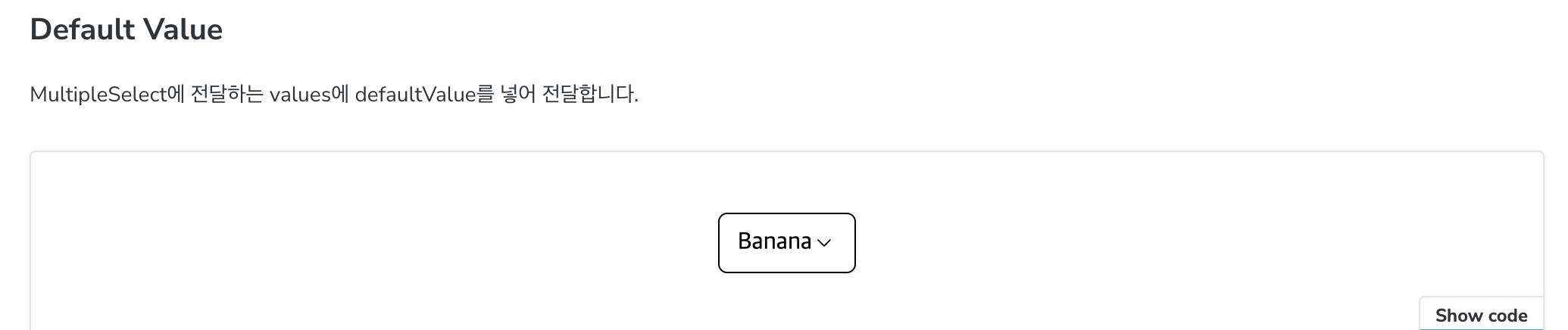
2. Default Value
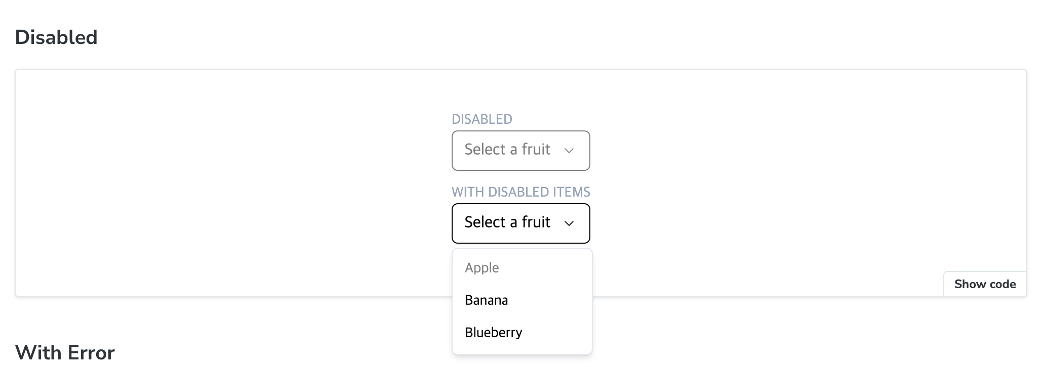
3. Disabled
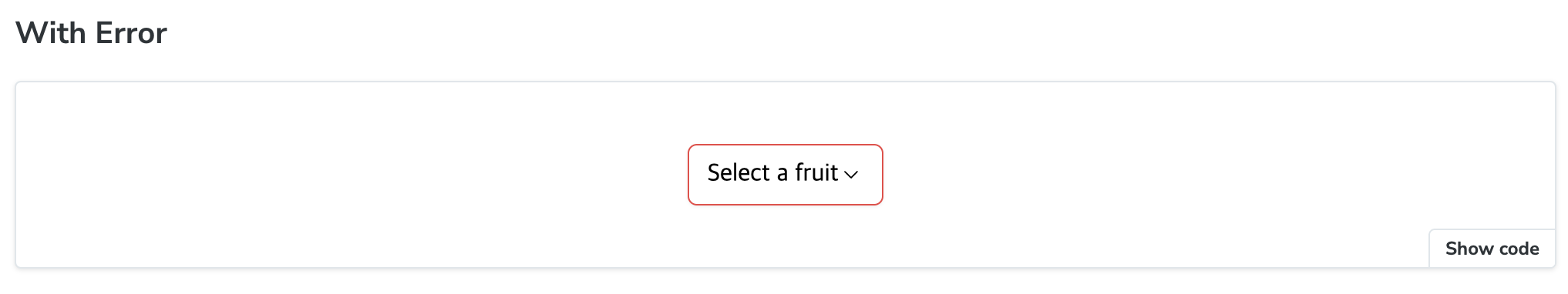
4. With Error
5. Position
6. Scrollable
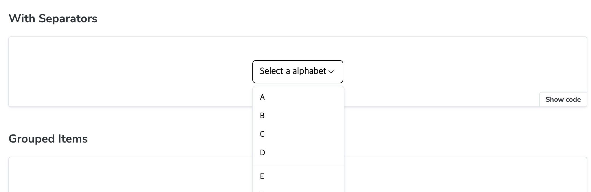
7. With Separators
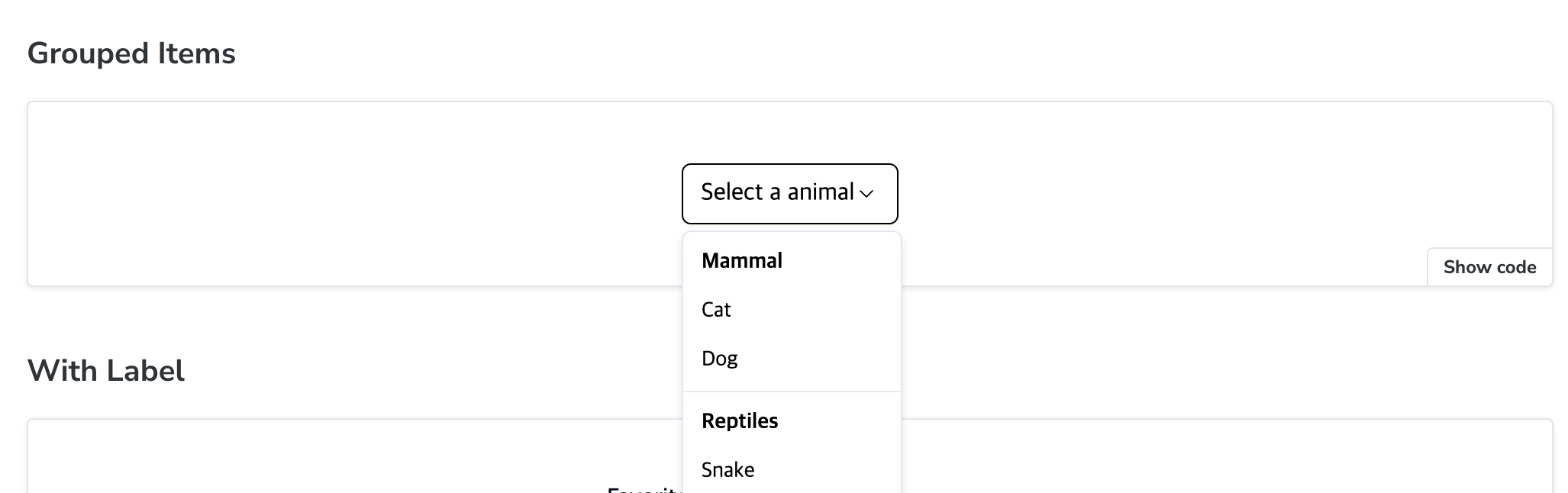
8. Grouped Items
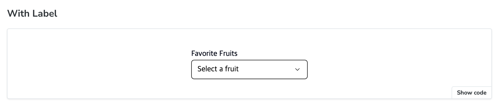
9. With Label
10. Custom Example
회고
- Select 컴포넌트에 어떤 속성들이 있는지 하나하나 사용해 본 것이 Multiple Select 구현시에 도움이 많이 되었다.
- 핸들러를 활용하면서 코드가 더러워지고 점점 복잡해지는 것 같아 피드백을 받았다. 몇 분만에 깔끔하게 같이 정리해주셔서 감탄했다.
참고자료
https://ui.shadcn.com/docs/components/select
https://www.radix-ui.com/primitives/docs/components/select#api-reference