-
[shadcn/ui] Dialog, Alert Dialog Component 구현기Front-End/React 2024. 5. 14. 14:07
🍀 목차
Shadcn/ui Dialog(+Alert Dialog) 뜯어보기 & 속성 설명
UI 커스텀과 작성한 스토리
회고개요
Modal Component는 현재 제품에서 가장 많이 쓰이는 컴포넌트 중 하나다. Avatar Component처럼 처음부터 인터페이스 제작 -> UI 구현까지 하기에는 시간이 부족하여 shadcn/ui의 Dialog, Alert Dialog를 제품에 맞게 커스텀하기로 결정하였다.
시작하기에 앞서 Modal, Confirm, Alert의 차이를 알아봤다.
- Modal : 주의가 필요하거나 추가 정보를 제공하는 팝업 콘텐츠. 텍스트, 양식 입력 같은 다른 대화형 요소를 포함할 수 있고 사용자가 Modal 외부를 클릭하거나 특정 버튼(닫기, 취소, 저장)을 클릭할 때까지 다른 인터페이스 요소와의 상호작용을 차단한다.
- Confirm : 사용자에게 결정을 요구하는 Modal 유형의 대화 상자. 주로 "예" 또는 "아니요" 두 가지 옵션을 제공하여 사용자가 진행할지 여부를 선택하게 한다. 파일 삭제, 변경 사항 적용 여부 등 특정 행동에 대한 사용자의 명시적인 승인이나 거절을 요구할 때 사용된다.
- Alert : 사용자에게 정보를 알리는 데 사용되는 가장 간단한 형태의 대화 상자이다. 일반적으로 버튼 하나만을 포함, 사용자가 해당 버튼을 클릭하여 대화 상자를 닫기 전까지 다른 인터페이스와의 상호작용을 차단한다. 시스템의 중요 변경 사항, 오류 메시지, 경고 또는 확인이 필요한 중요한 정보를 전달하는 데 사용된다.
- 보통 Modal은 Confirm, Alert, Dialog를 포함하는 개념. 이들은 특수한 형태의 Modal이다.
Shadcn/ui Dialog(+Alert Dialog) 뜯어보기 & 속성 설명
Dialog

shadcn/ui Dialog 소개 Code
"use client"

import * as React from "react"
import * as DialogPrimitive from "@radix-ui/react-dialog"
import { Cross2Icon } from "@radix-ui/react-icons"

import { cn } from "@/lib/utils"

const Dialog = DialogPrimitive.Root

const DialogTrigger = DialogPrimitive.Trigger

const DialogPortal = DialogPrimitive.Portal

const DialogClose = DialogPrimitive.Close

const DialogOverlay = React.forwardRef<
  React.ElementRef<typeof DialogPrimitive.Overlay>,
  React.ComponentPropsWithoutRef<typeof DialogPrimitive.Overlay>
>(({ className, ...props }, ref) => (
  <DialogPrimitive.Overlay
    ref={ref}
    className={cn(
      "fixed inset-0 z-50 bg-black/80  data-[state=open]:animate-in data-[state=closed]:animate-out data-[state=closed]:fade-out-0 data-[state=open]:fade-in-0",
      className
    )}
    {...props}
  />
))
DialogOverlay.displayName = DialogPrimitive.Overlay.displayName

const DialogContent = React.forwardRef<
  React.ElementRef<typeof DialogPrimitive.Content>,
  React.ComponentPropsWithoutRef<typeof DialogPrimitive.Content>
>(({ className, children, ...props }, ref) => (
  <DialogPortal>
    <DialogOverlay />
    <DialogPrimitive.Content
      ref={ref}
      className={cn(
        "fixed left-[50%] top-[50%] z-50 grid w-full max-w-lg translate-x-[-50%] translate-y-[-50%] gap-4 border bg-background p-6 shadow-lg duration-200 data-[state=open]:animate-in data-[state=closed]:animate-out data-[state=closed]:fade-out-0 data-[state=open]:fade-in-0 data-[state=closed]:zoom-out-95 data-[state=open]:zoom-in-95 data-[state=closed]:slide-out-to-left-1/2 data-[state=closed]:slide-out-to-top-[48%] data-[state=open]:slide-in-from-left-1/2 data-[state=open]:slide-in-from-top-[48%] sm:rounded-lg",
        className
      )}
      {...props}
    >
      {children}
      <DialogPrimitive.Close className="absolute right-4 top-4 rounded-sm opacity-70 ring-offset-background transition-opacity hover:opacity-100 focus:outline-none focus:ring-2 focus:ring-ring focus:ring-offset-2 disabled:pointer-events-none data-[state=open]:bg-accent data-[state=open]:text-muted-foreground">
        <Cross2Icon className="h-4 w-4" />
        <span className="sr-only">Close</span>
      </DialogPrimitive.Close>
    </DialogPrimitive.Content>
  </DialogPortal>
))
DialogContent.displayName = DialogPrimitive.Content.displayName

const DialogHeader = ({
  className,
  ...props
}: React.HTMLAttributes<HTMLDivElement>) => (
  <div
    className={cn(
      "flex flex-col space-y-1.5 text-center sm:text-left",
      className
    )}
    {...props}
  />
)
DialogHeader.displayName = "DialogHeader"

const DialogFooter = ({
  className,
  ...props
}: React.HTMLAttributes<HTMLDivElement>) => (
  <div
    className={cn(
      "flex flex-col-reverse sm:flex-row sm:justify-end sm:space-x-2",
      className
    )}
    {...props}
  />
)
DialogFooter.displayName = "DialogFooter"

const DialogTitle = React.forwardRef<
  React.ElementRef<typeof DialogPrimitive.Title>,
  React.ComponentPropsWithoutRef<typeof DialogPrimitive.Title>
>(({ className, ...props }, ref) => (
  <DialogPrimitive.Title
    ref={ref}
    className={cn(
      "text-lg font-semibold leading-none tracking-tight",
      className
    )}
    {...props}
  />
))
DialogTitle.displayName = DialogPrimitive.Title.displayName

const DialogDescription = React.forwardRef<
  React.ElementRef<typeof DialogPrimitive.Description>,
  React.ComponentPropsWithoutRef<typeof DialogPrimitive.Description>
>(({ className, ...props }, ref) => (
  <DialogPrimitive.Description
    ref={ref}
    className={cn("text-sm text-muted-foreground", className)}
    {...props}
  />
))
DialogDescription.displayName = DialogPrimitive.Description.displayName

export {
  Dialog,
  DialogPortal,
  DialogOverlay,
  DialogTrigger,
  DialogClose,
  DialogContent,
  DialogHeader,
  DialogFooter,
  DialogTitle,
  DialogDescription,
}
Anatomy
import * as Dialog from '@radix-ui/react-dialog';

export default () => (
  <Dialog.Root> // dialog의 모든 부분을 포함
    <Dialog.Trigger /> // 버튼으로 트리거되는 dialog를 여는 버튼
    <Dialog.Portal> // 오버레이 및 콘텐츠 부분을 body로 이동시킴
      <Dialog.Overlay /> // dialog가 열려있을 때 뒤에 어둡게 깔리는 시각적 요소
      <Dialog.Content> // open dialog에 렌더링할 컨텐츠
        <Dialog.Title /> // open dialog에 표시되는 제목
        <Dialog.Description /> // open dialog에 표시되는 설명(선택 사항)
        <Dialog.Close /> // dialog를 닫는 버튼
      </Dialog.Content>
    </Dialog.Portal>
  </Dialog.Root>
);
shadcn/ui는 Radix를 커스텀하여 사용하고 있기 때문에 API Reference가 Radix Dialog와 이어진다.
사용자가 알아야 할 컴포넌트의 Props를 살펴보자.
Root
Prop Type Default defaultOpen boolean - open boolean - onOpenChange function - modal boolean true defaultOpen: 처음 렌더링되었을 때 dialog가 open 상태일 때로 제어하고 싶다면 사용.open: onOpenChange와 함께 사용하며 dialog의 open state를 제어한다.onOpenChange: dialog의 open state가 변경되면 호출되는 이벤트 핸들러.modal: Modality를 나타낸다. Modality는 사용자에게 오버레이를 어둡게 깔아 Dialog를 제외한 외부 요소와의 상호 작용을 막는 것을 의미한다. true로 설정 시 외부 요소와의 상호 작용이 비활성화되고 dialog content만 표시된다.
Trigger
Prop Type Default asChild boolean false 이후부터 asChild prop을 자주 볼 수 있는데, 이는 자식으로 전달하는 요소에 해당 컴포넌트의 기본 렌더링 요소를 병합시키겠다는 의미이다.
예를 들어, Trigger은 버튼으로 만들어져 있다. asChild prop을 주지 않으면,
<DialogTrigger>
	<p>Not asChild Text</p>
</DialogTrigger>

// <button><p>Not asChild...
위의 Not asChild Text는 html 요소로 확인 시 그저 button으로 감싸진 paragraph 태그로 확인된다.
그런데 asChild prop을 주게 되면,
<DialogTrigger asChild>
	<p>Not asChild Text</p>
</DialogTrigger>

// <p type="button" ...>asChild...
paragraph 태그로 Trigger의 기능을 수행하는 것을 볼 수 있다.
Content
Prop Type Default asChild boolean false forceMount boolean - onOpenAutoFocus function
(event: Event) => void- onCloseAuthFocus function
(event: Event) => void- onEscapeKeyDown function
(event: KeyboardEvent) => void- onPointerDownOutside function
(event: PointerDownOutsideEvent) => void- onInteractOutside function
(event: React.FocusEvent | MouseEvent | TouchEvent) => void- onOpenAutoFocus: 열린 후 포커스가 구성요소로 이동할 때 호출되는 이벤트 핸들러. event.preventDefault로 방지 가능.onCloseAuthFocus: 닫은 후 포커스가 트리거로 이동하면 호출되는 이벤트 핸들러. event.preventDefault로 방지 가능.onEscapeKeyDown: Esc 키를 눌렀을 때 호출되는 이벤트 핸들러. event.preventDefault로 방지 가능.onPointerDownOutside: 포인터 이벤트가 구성 요소 경계 외부에서 발생할 때 호출되는 이벤트 핸들러. event.preventDefault로 방지 가능.onInteractOutside: 상호 작용(포인터 또는 포커스 이벤트)이 구성 요소 범위 외부에서 발생할 때 호출되는 이벤트 핸들러. event.preventDefault로 방지 가능.
Title
title을 숨기고 싶다면 Radix에서 제공하는 유틸리티 Visually Hidden을 사용하여 <VisuallyHidden asChild>로 감싼다.
Prop Type Default asChild boolean false Description
description 또한 숨기려면 <VisuallyHidden asChild>로 감싼다. 완전히 제거하려면
aria-describedby={undefined}를 Dialog.Content에 전달한다.Prop Type Default asChild boolean false Close
Prop Type Default asChild boolean false Alert Dialog

shadcn/ui Alert Dialog 소개 Anatomy
import * as AlertDialog from '@radix-ui/react-alert-dialog';

export default () => (
  <AlertDialog.Root>
    <AlertDialog.Trigger />
    <AlertDialog.Portal>
      <AlertDialog.Overlay />
      <AlertDialog.Content>
        <AlertDialog.Title />
        <AlertDialog.Description />
        <AlertDialog.Cancel />
        <AlertDialog.Action />
      </AlertDialog.Content>
    </AlertDialog.Portal>
  </AlertDialog.Root>
);
Anatomy를 보면 Dialog와 동일한 것을 알 수 있다. prop들의 기능들도 동일하다. 크게 다른 점은 Alert Dialog는 Dialog 외부를 클릭해도 Dialog가 Close 되지 않는다는 것이다.
UI 커스텀과 작성한 스토리
UI 커스텀
팀원들의 피드백을 받아 커스텀을 진행한 부분은 두 가지이다.
1. 모바일 크기의 화면을 경우 Dialog가 밑으로 뜨게 수정
DialogContent에 Tailwind Breakpoint prefix인 sm을 활용하여 640px 미만일 때는 아래에서 뜨도록 수정하였다.

shadcn/ui Dialog 모바일 기기로 확인할 시 
모바일 기기는 밑에 고정된 Dialog가 보이도록 커스텀 진행 2. Dialog에 내장된 x 버튼을 선택적으로 렌더링 하도록 수정

기본 내장 x 버튼 showIconCloseButton prop을 추가하여 x 버튼을 선택적으로 렌더링 할 수 있도록 수정하였다.
const DialogContent = React.forwardRef<
  React.ElementRef<typeof DialogPrimitive.Content>,
  React.ComponentPropsWithoutRef<typeof DialogPrimitive.Content> & {
    showIconCloseButton?: boolean;
  }
>
{showIconCloseButton && ( <DialogPrimitive.Close className='...'> <Icon name='X' size='small' color='black' /> </DialogPrimitive.Close> )}작성 스토리
개발했던 어떤 컴포넌트들보다 스토리북에 공을 들인 컴포넌트가 Dialog, Alert Dialog다.
위에서 정리했던 것처럼 컴포넌트의 prop들의 양이 많기에 우리 컴포넌트로 수정했음에도 웬만큼 스토리북을 상세히 작성하지 않으면 Radix 홈페이지에서 사용법을 익힐 것 같다는 의견이 나왔기 때문이다. 그렇게 shadcn/ui, Radix 페이지와 팀원들의 피드백을 받고 최종적으로 만들어진 스토리는 총 6가지이다.
우선, 하나의 컴포넌트 단위 스토리에서 속성들에 대한 설명을 작성하기 위해 여러 컴포넌트들의 prop들을 합쳐주었다.
Dialog(Root), DialogTrigger, DialogContent만 유니온 해줘도 Dialog(AlertDialog)에서 알아야 할 속성들은 다 설명할 수 있다. 다만 Checkbox 컴포넌트에서도 이 방법을 썼었는데 컴포넌트에 그대로 전달 시 충돌했던 적이 있어 유의해서 쓰자.
type DialogComponentProps =
  | typeof Dialog
  | typeof DialogTrigger
  | typeof DialogContent;
const meta = { title: 'Component/Dialog', component: Dialog, parameters: { componentSubtitle: '사용자에게 정보를 제공하거나 상호작용을 포함하는 일반적인 modal dialog입니다. Alert Dialog와 달리 사용자의 응답을 반드시 요구하지 않으며, Dialog 경계 외부 클릭 시 닫힙니다.', }, argTypes: { // 생략 }, } satisfies Meta<DialogComponentProps>;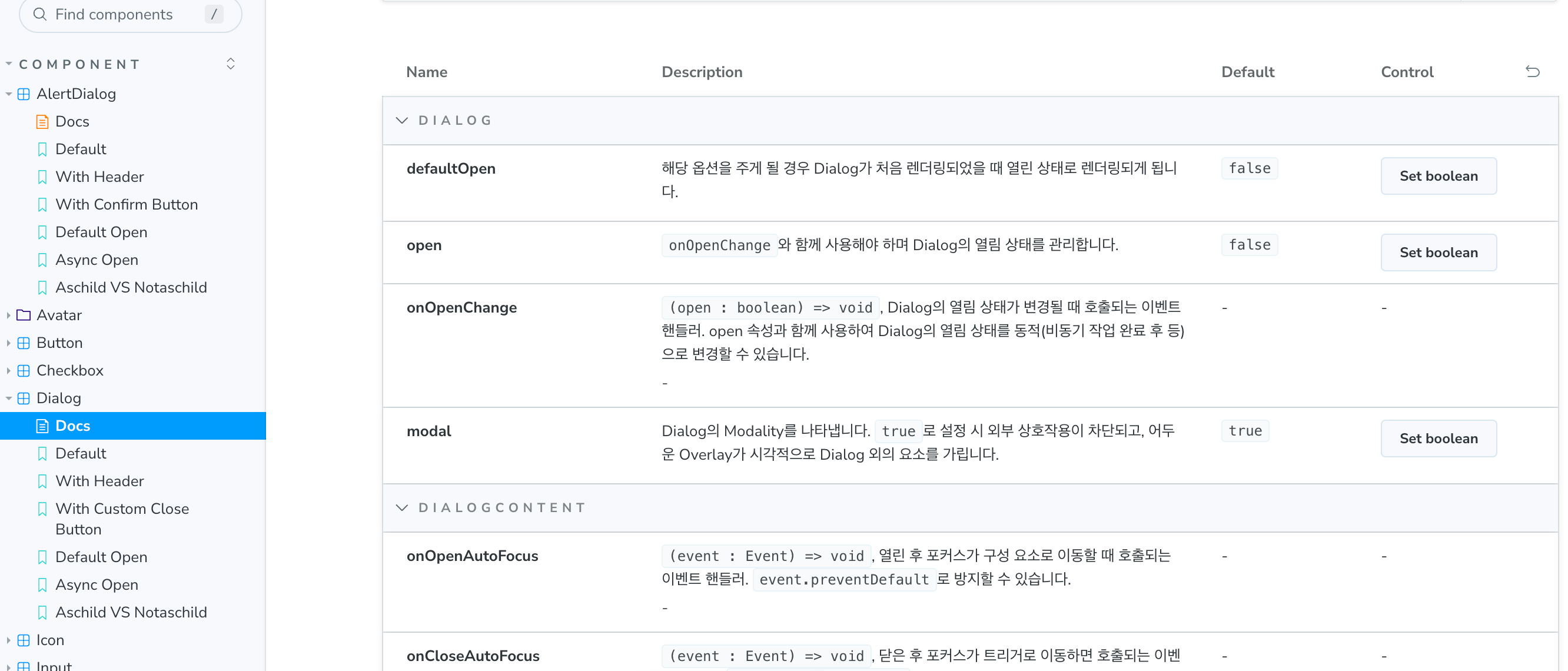
속성들에 대한 설명들 1. Default

default(1) 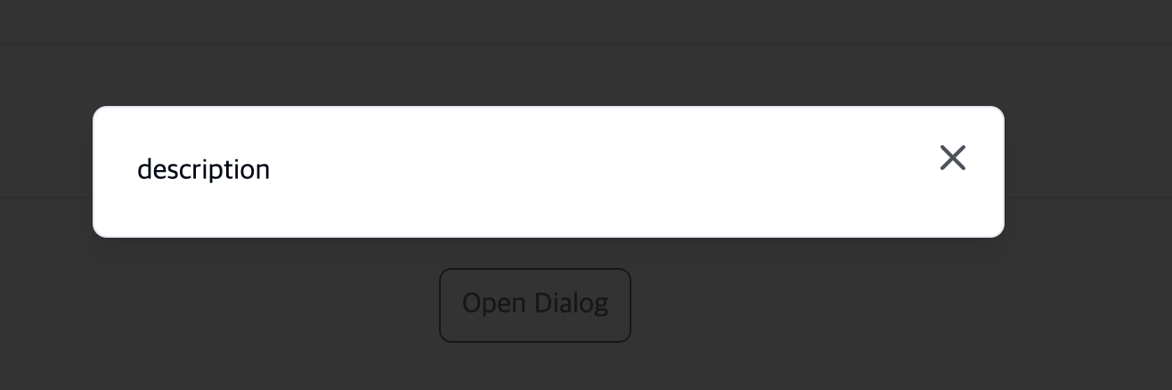
default(2) - open dialog 2. With Header

with header(1) 
with header(2) - open dialog 3. With Custom Close Button

with custom close button (1) 
with custom close button (2) - open dialog 4. Default Open
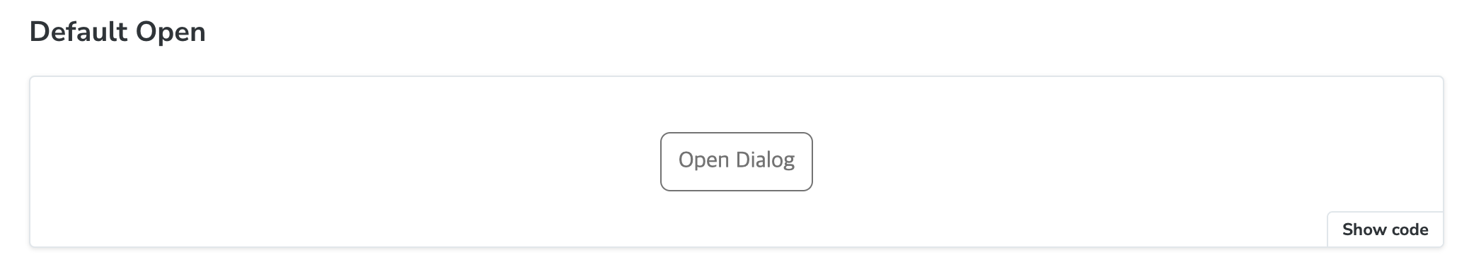
default open (1) 

처음부터 열린 상태로 나온다. 5. Async Open

async open (1) async open (2) - open dialog 6. Aschild VS Notaschild

asChild vs notasChild (1) 
asChild vs notasChild (2) - open dialog
회고- 처음부터 인터페이스부터 개발했던 컴포넌트들은 prop이나 기능을 설명하는 데 큰 어려움이 없었기에 shadcn/ui를 가볍게 커스텀한 이번 컴포넌트 개발은 새로운 경험이 되었다.
- prop들이 어떤 기능인지 하나씩 사용해 보면서 팀원들이 두 번 생각하지 않도록 노력했고 이 점에서 칭찬을 받아서 좋았다.
- 스토리가 피드백을 받으며 점점 상세해지는 것을 보고 뿌듯했다.
- 팀원들이 적극적으로 "A 속성의 사용법을 모르겠는데, 이를 활용한 스토리를 만들어주세요."라는 피드백을 해줘서 정말 좋았음!
참고자료
https://ui.shadcn.com/docs/components/dialog
https://www.radix-ui.com/primitives/docs/components/dialog#api-reference
https://ui.shadcn.com/docs/components/alert-dialog
https://www.radix-ui.com/primitives/docs/components/alert-dialog#api-reference